Credits
- Illustration —
- Building Photography —
- Print —
Memphis Printing Co.
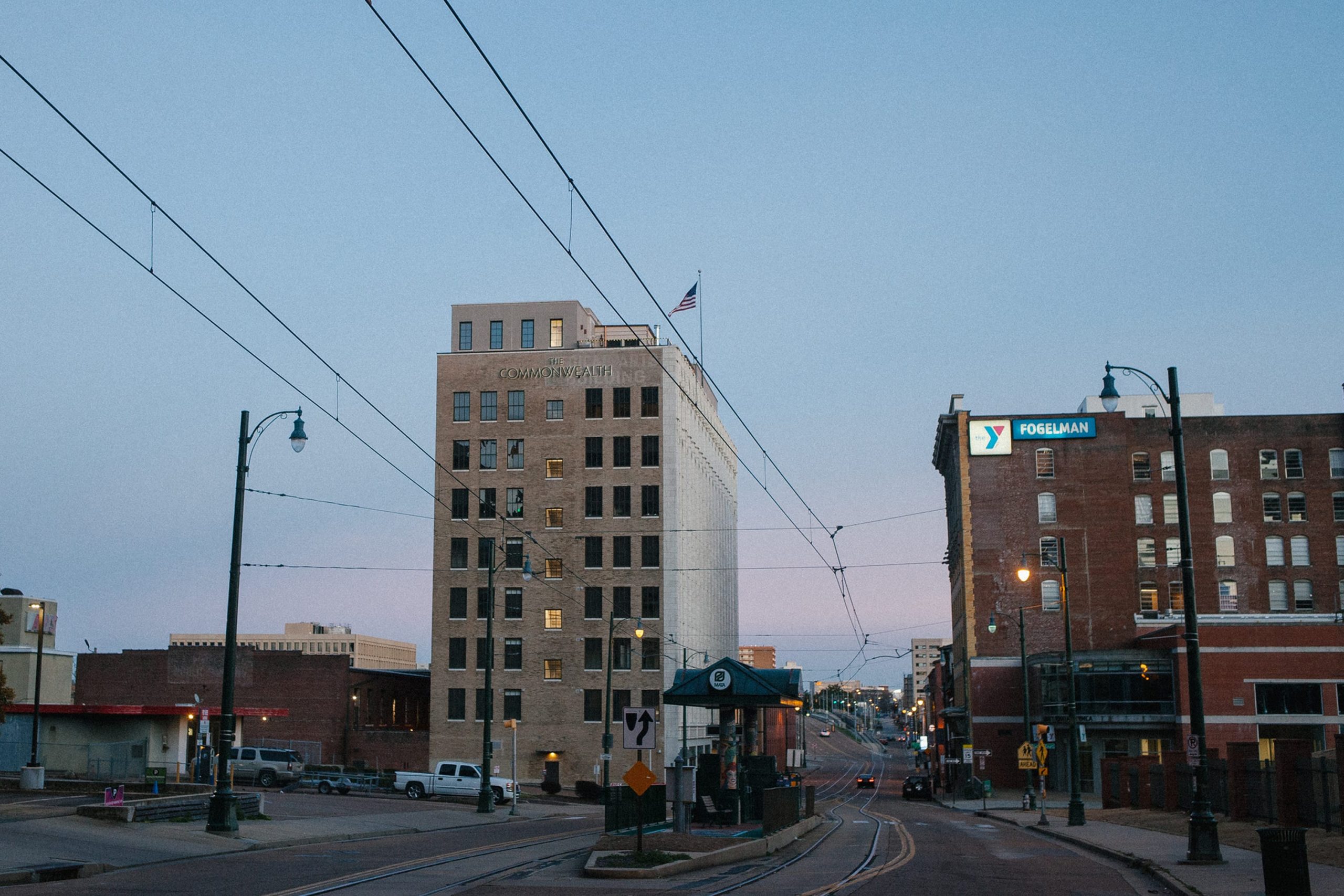
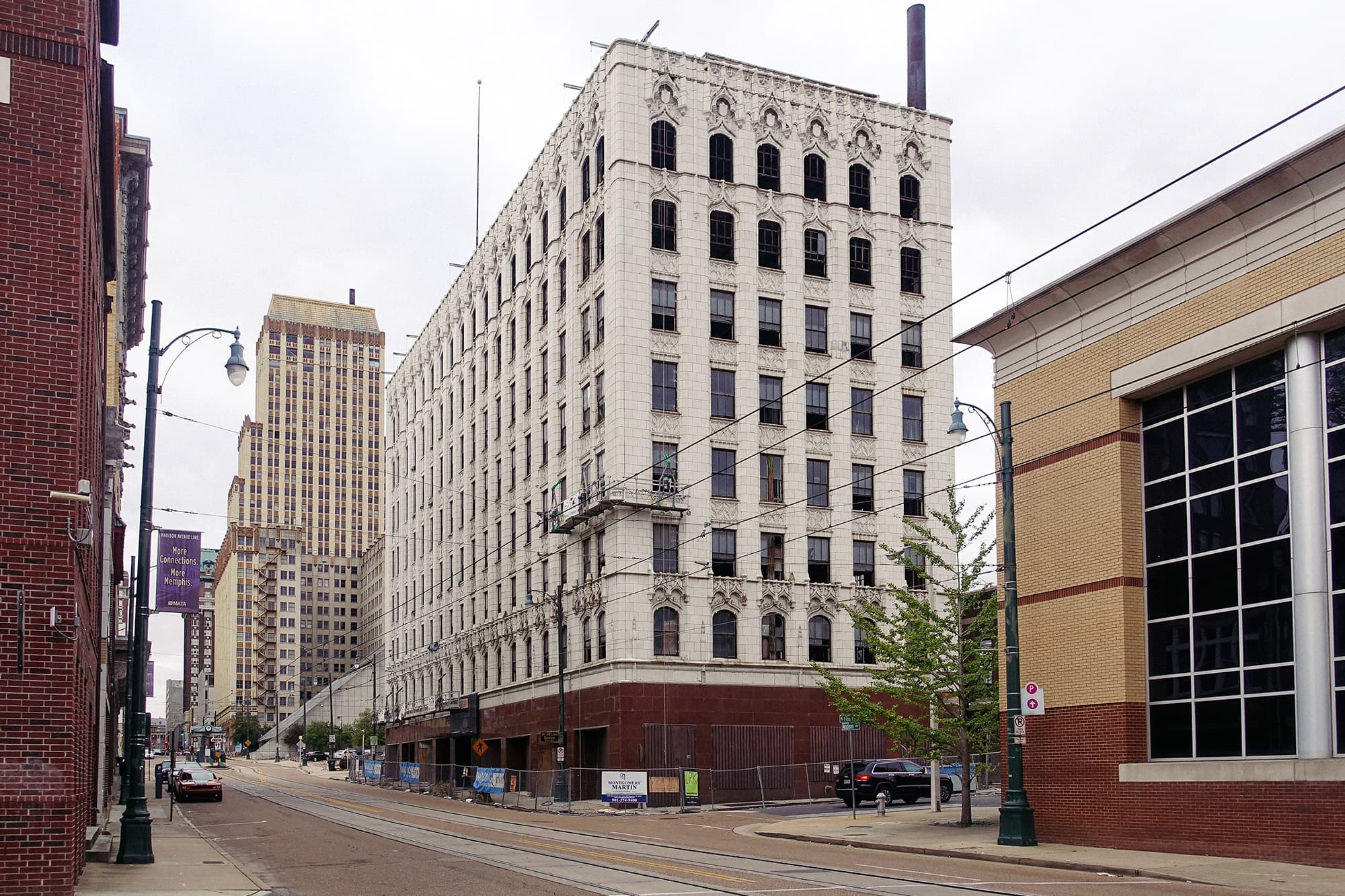
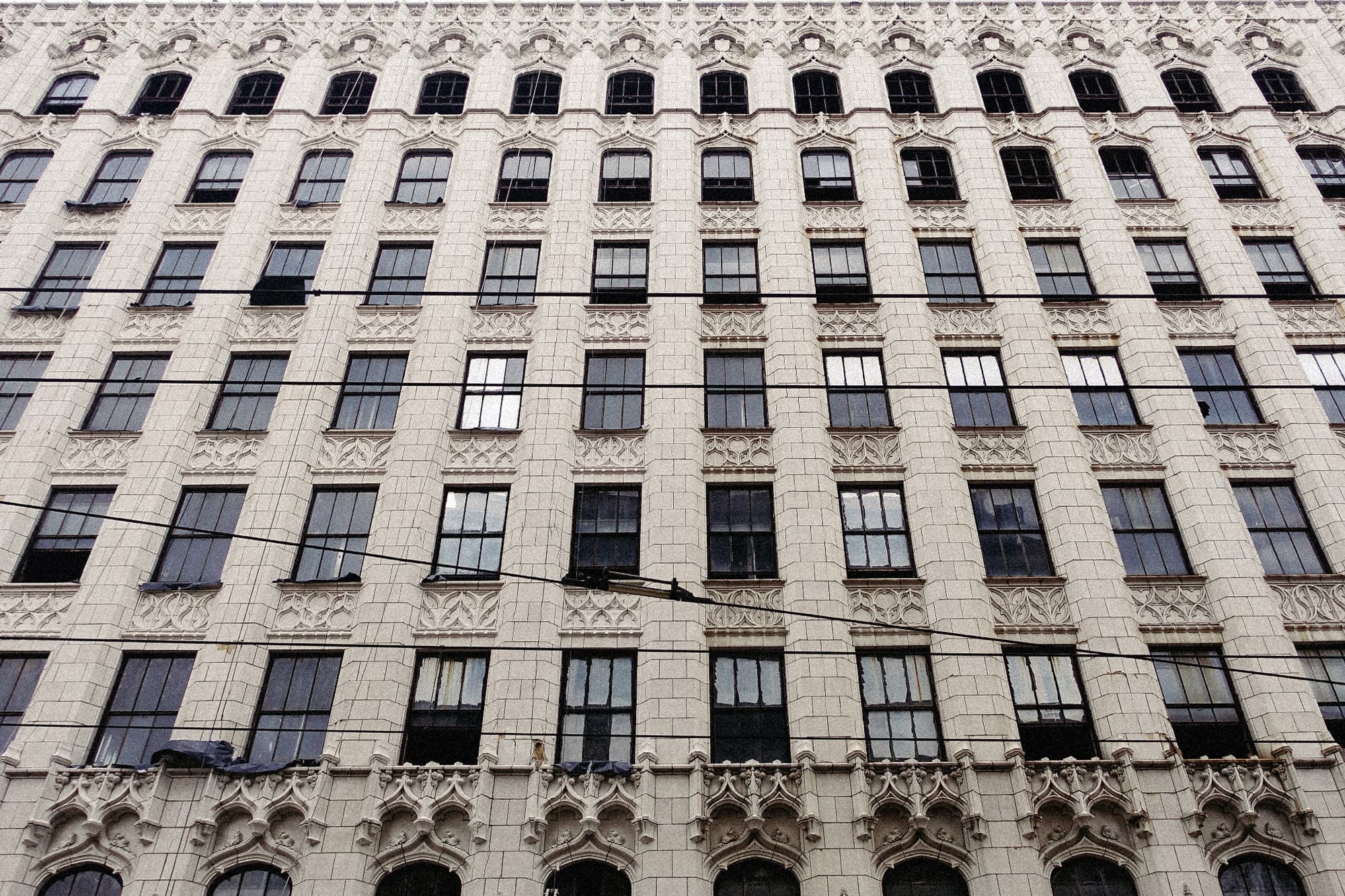
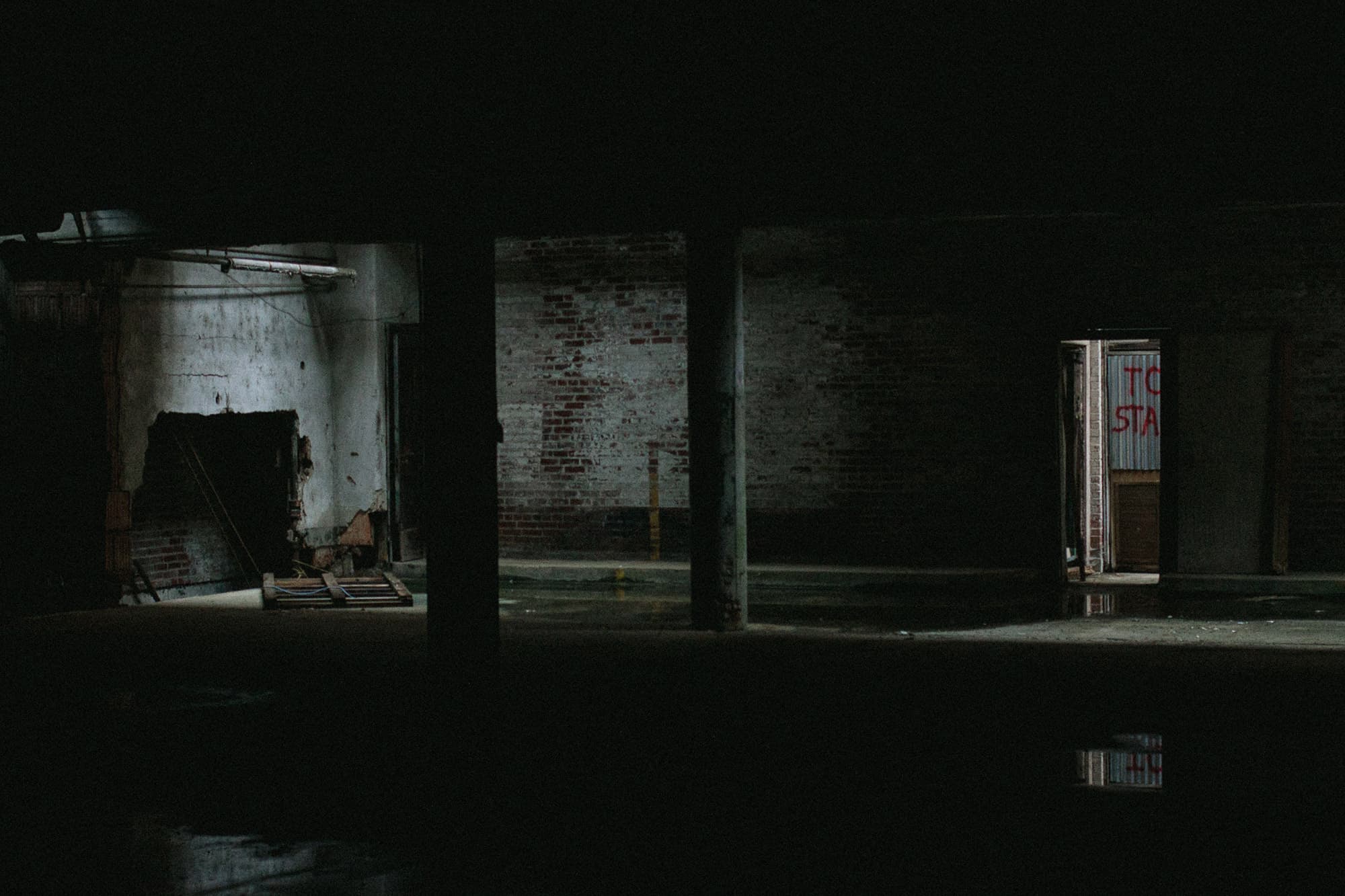
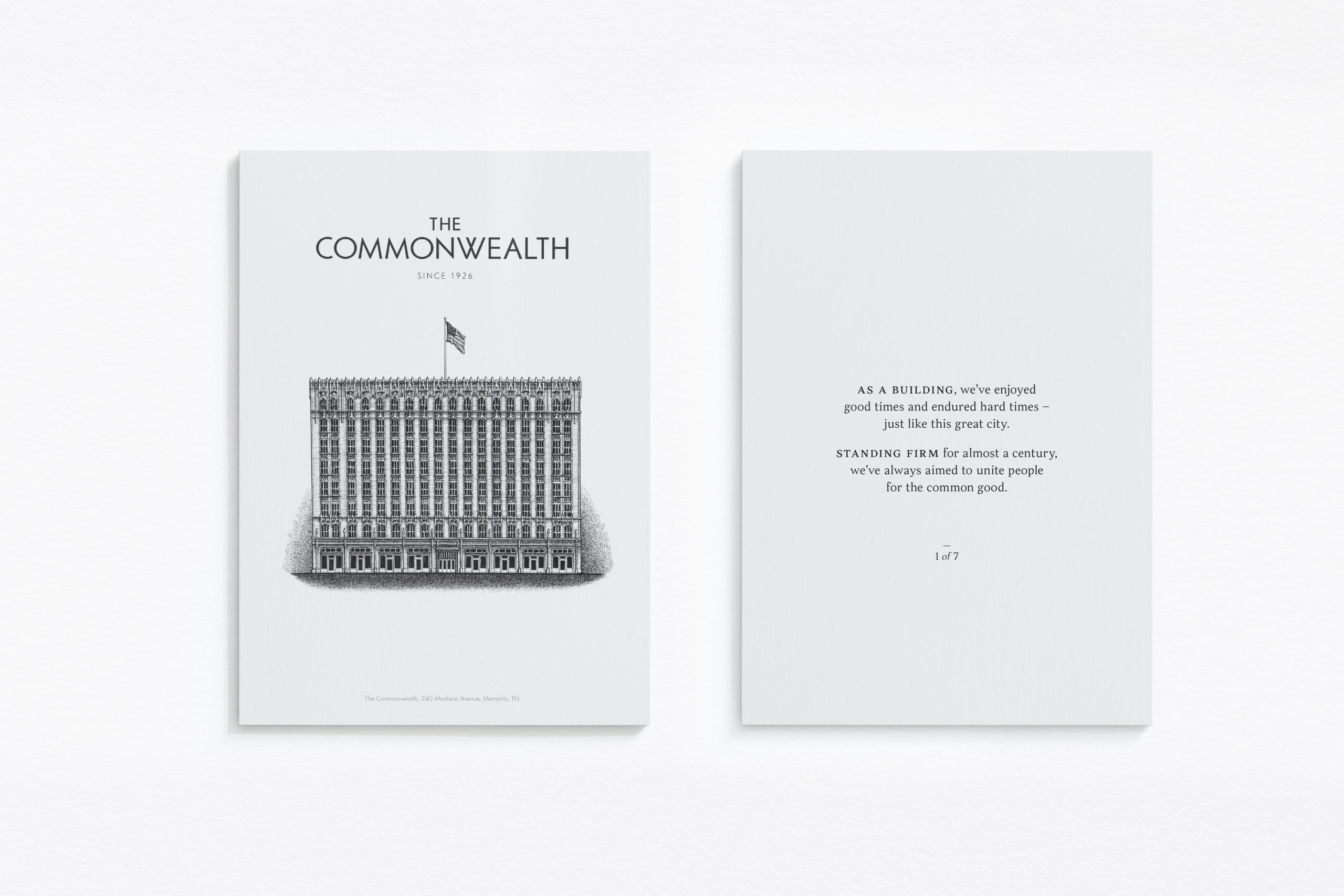
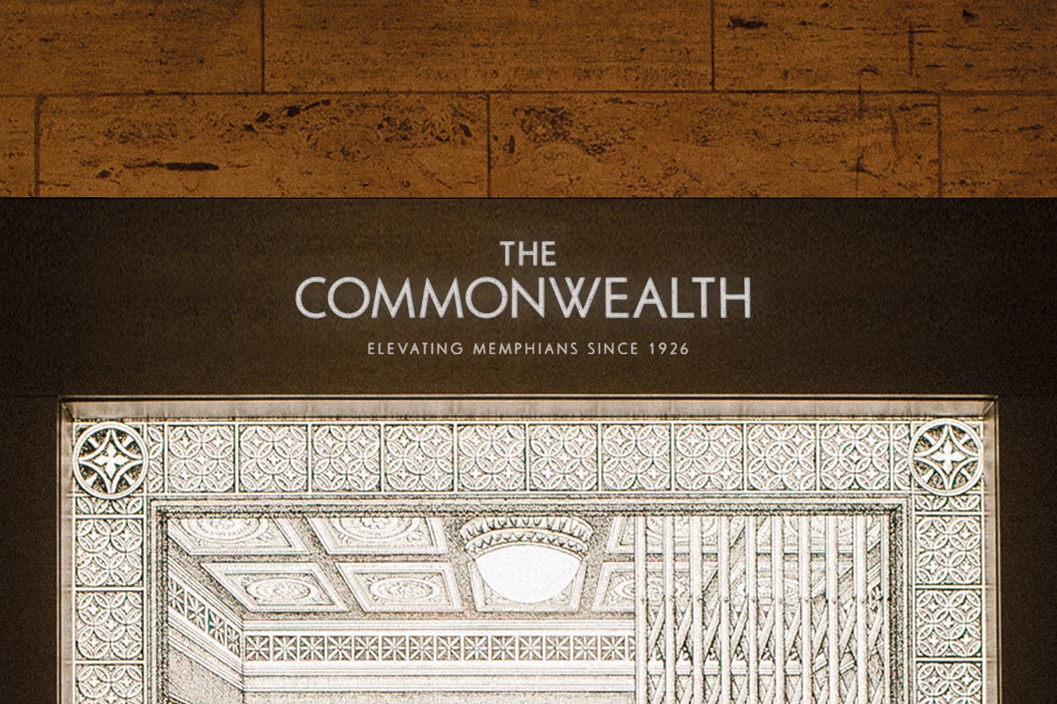
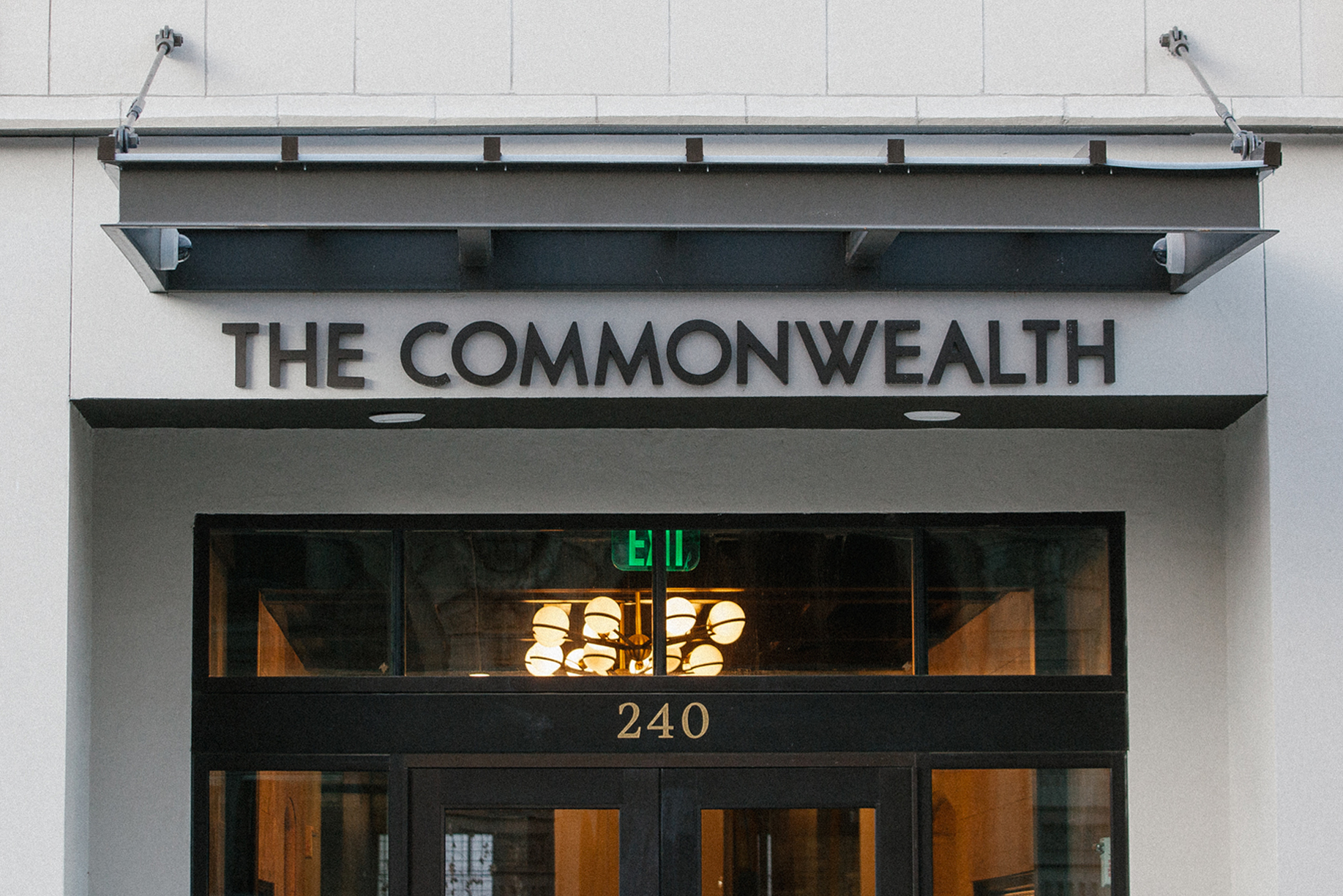
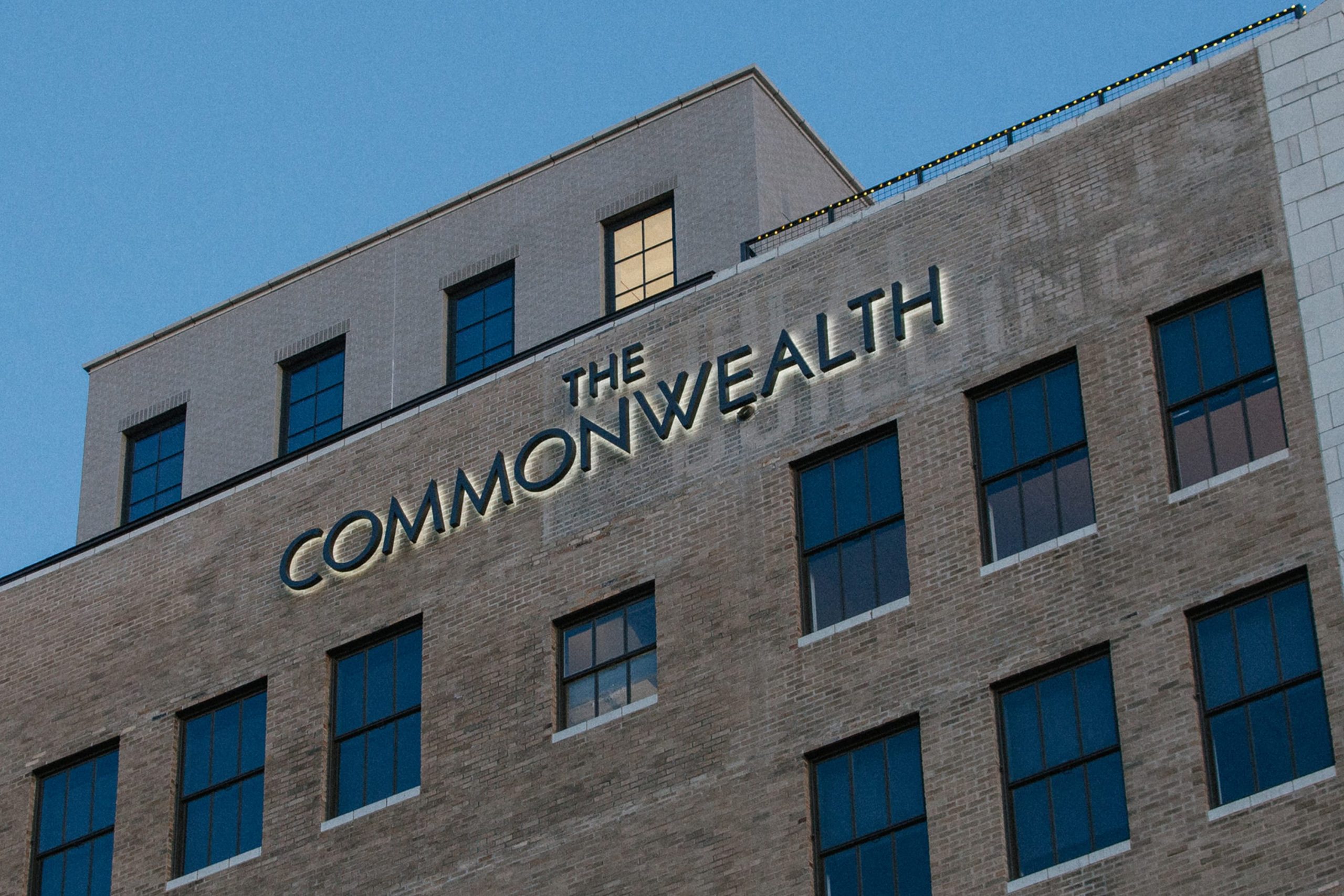
The Commonwealth is an iconic 8-storey, neo-gothic building in the heart of downtown Memphis, Tennessee. Rich in history, it had stood vacant for over three decades before a local consortium set their sights on it.
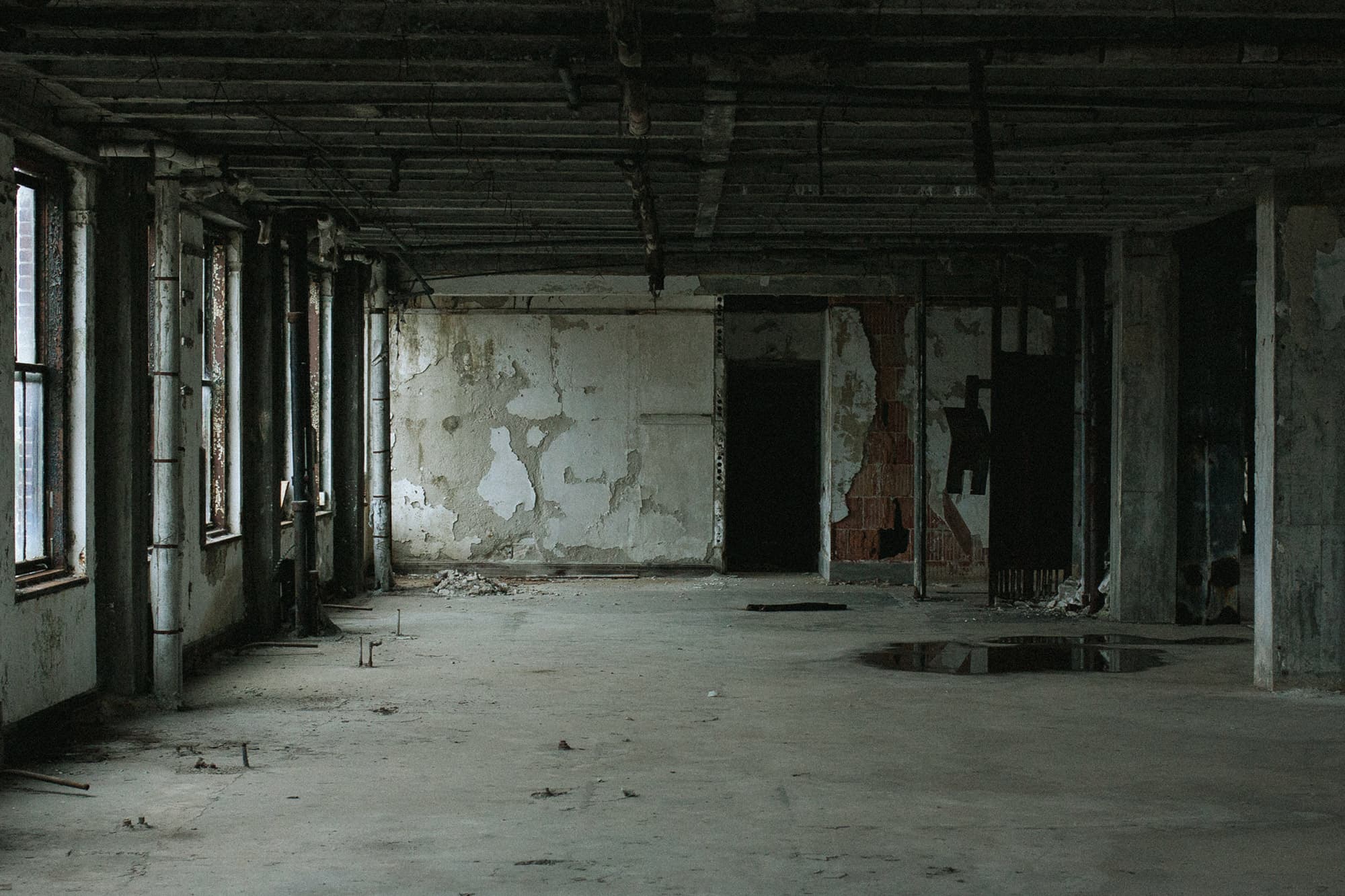
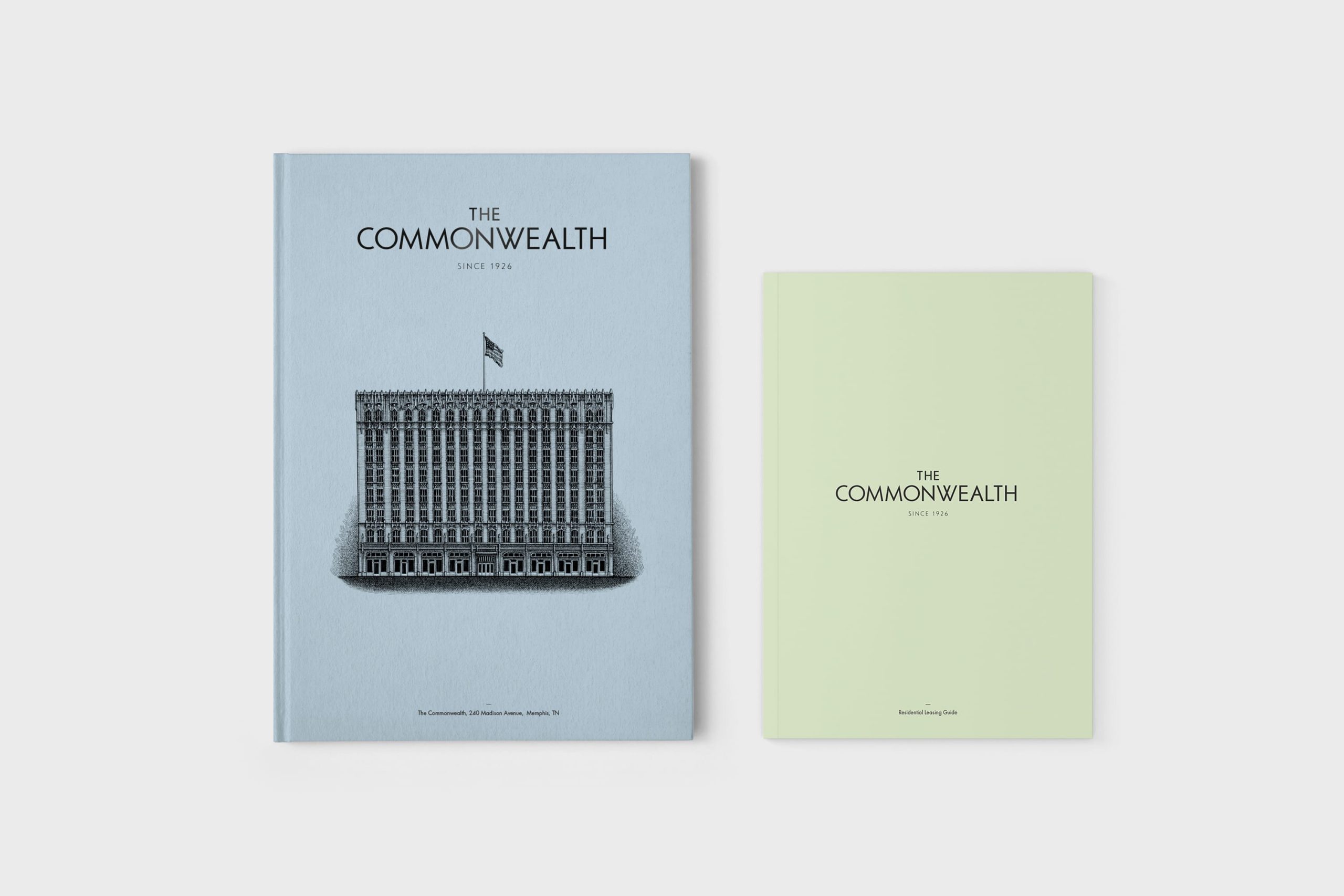
The new owners appointed us to name the third generation of this great building, and establish an identity worthy of the next chapter in its history.
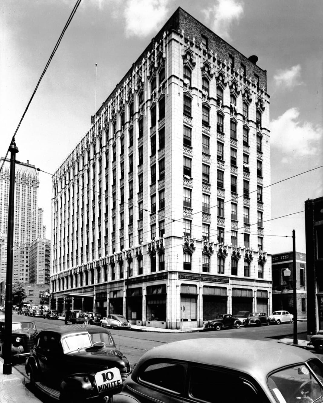
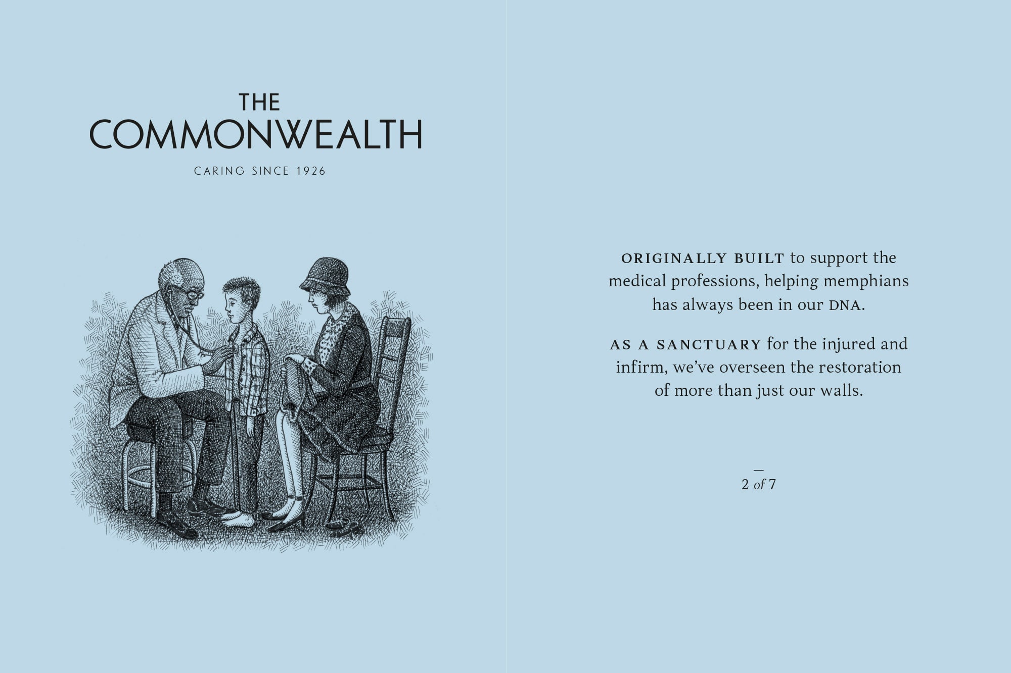
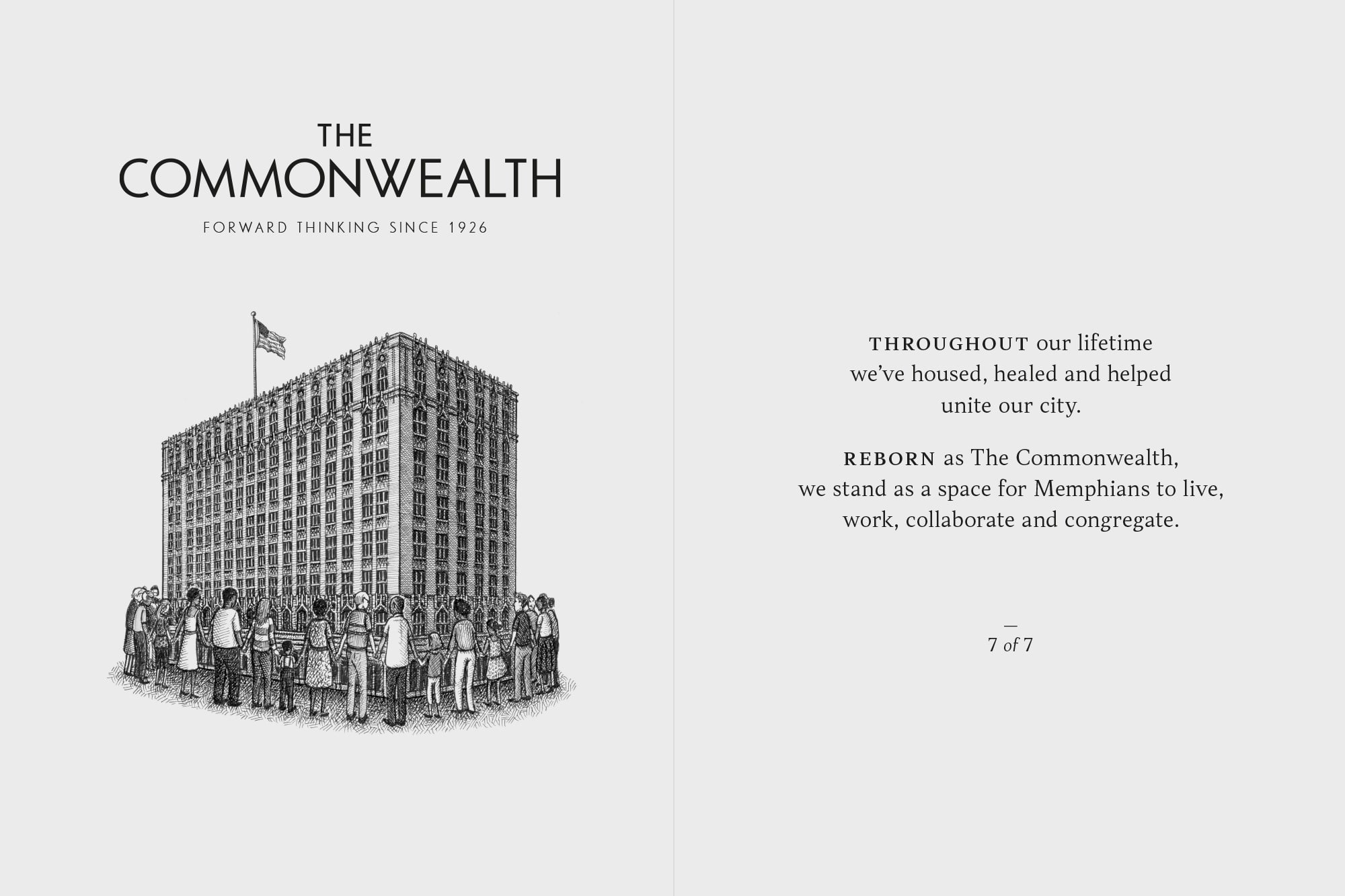
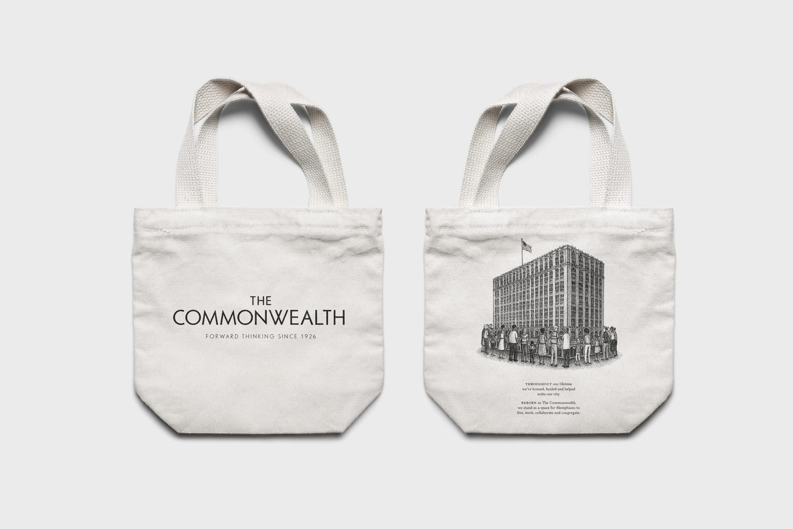
The building was founded in 1926 as the Medical Arts Building, for the common good of all Memphians. The restored space would be for the community too; this time to live, work, collaborate and congregate.
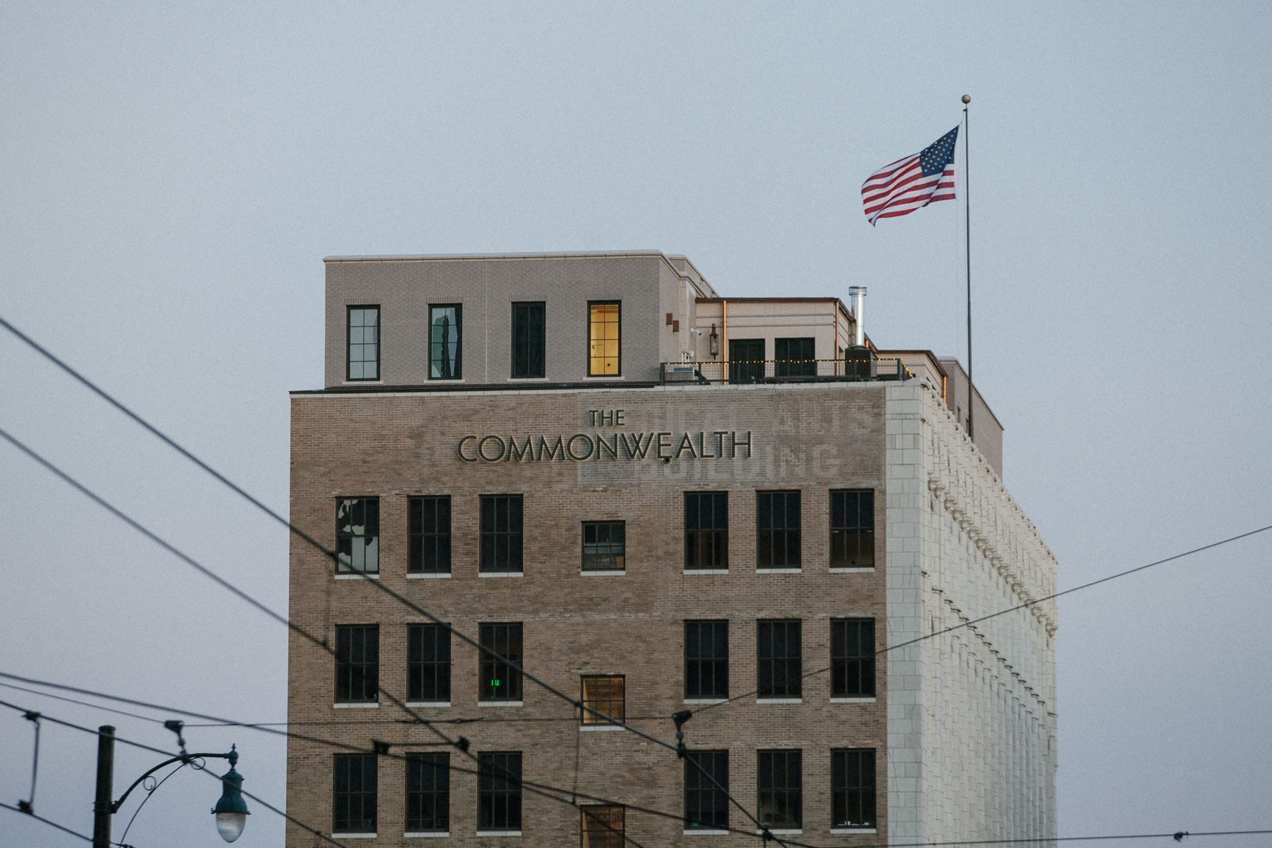
And so The Commonwealth was born; a name that both reflected its past, and looked to the future.
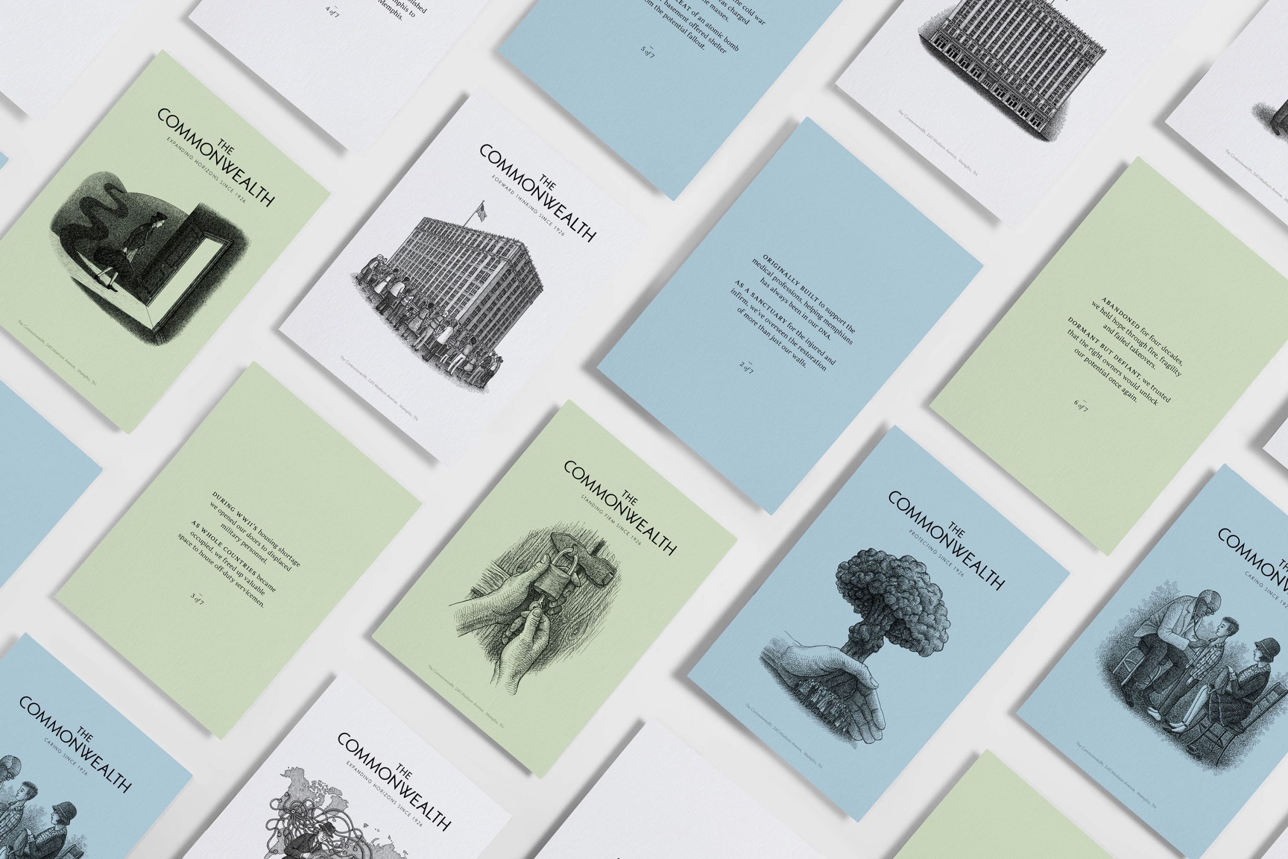
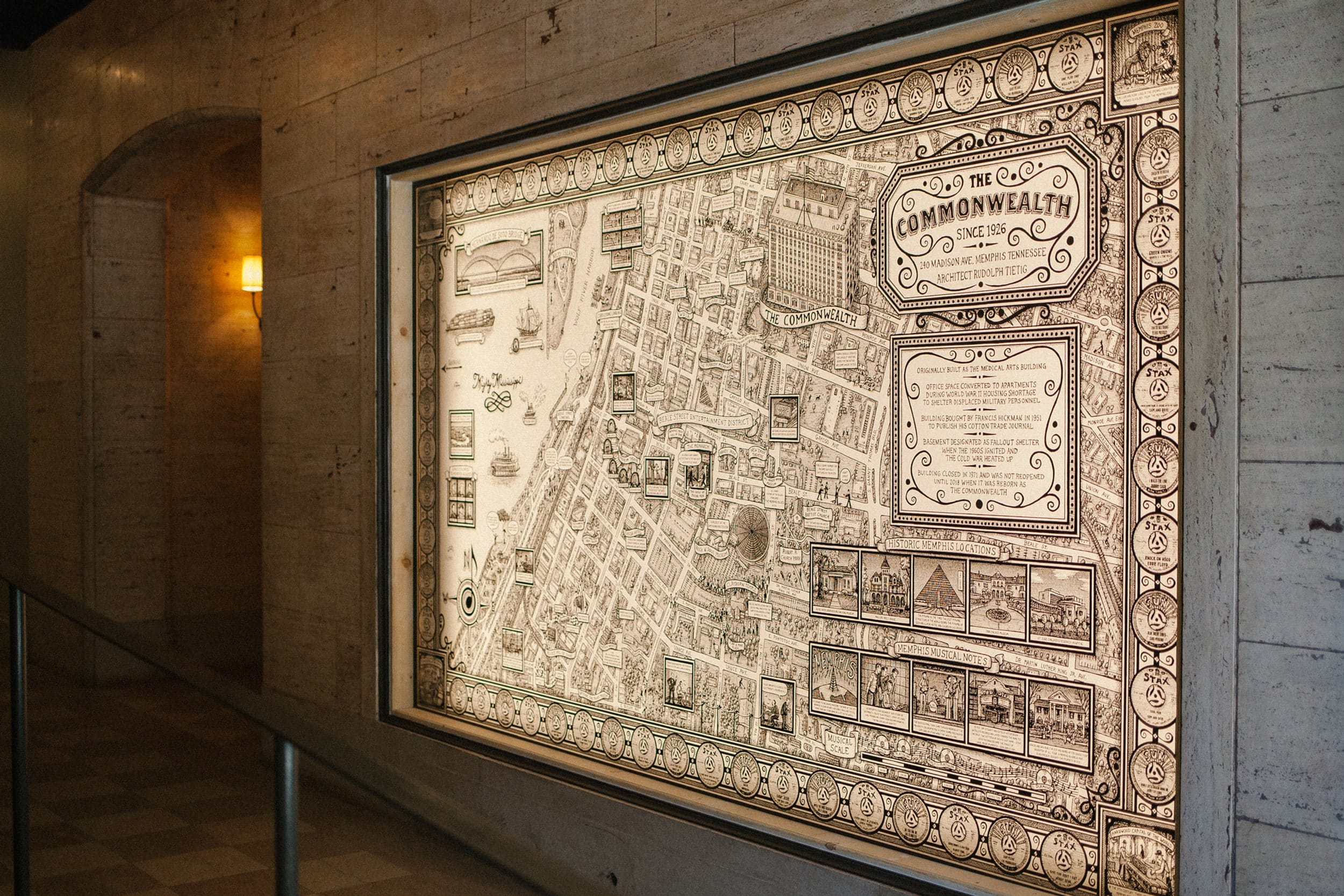
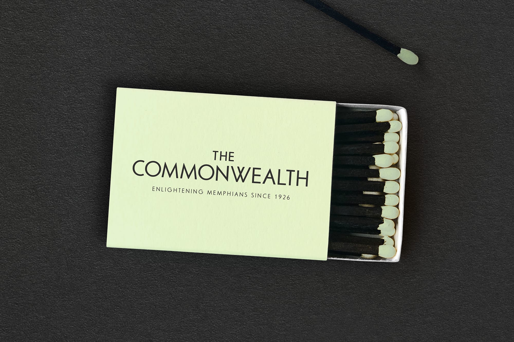
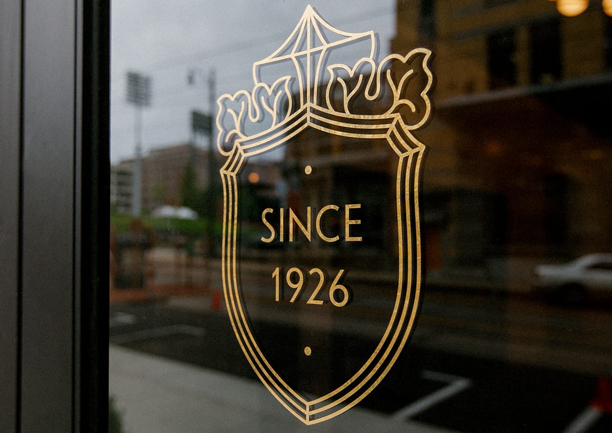
We went on to establish the positioning line ‘Since 1926’. This reinforced the building’s long-standing in Memphis, whilst providing us with a framework to tell and illustrate the building’s colourful past through a series of short stories.
When we set out to name and brand our historic building, we were eager to find a design partner who would provide fresh and progressive ideas while also honoring our building’s varied past. Land of Plenty instantly met us in that endeavor and achieved a classic yet sophisticated end product. We enjoyed every step of the process and would absolutely recommend Land of Plenty to others.
Developer
For all Memphians
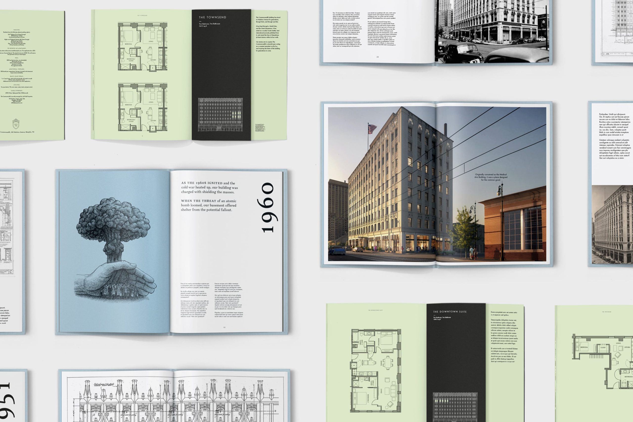
The stories helped to redefine the building, from run-down eyesore, to characterful do-gooder.
We commissioned Chicago-based cross-hatching maestro Landis Blair to beautifully bring the stories to life.
Born in the same year
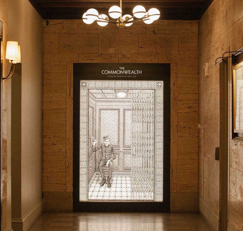
Not only was the brand typeface, Erbar Grotesk, inspired by the original blueprints, it was a font designed in the same year the building was built: 1926. We re-drew the W in the wordmark to reflect characteristics in the Ws on the blueprints.
A part of society
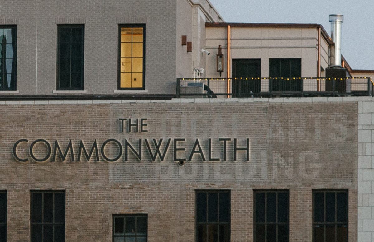
The building was originally constructed to house the medical professions, before succumbing to the Great Depression.
Its proud history inspired the consortium’s ambitions for the development, and led to the brand and naming strategy. We chose to leave the original ‘ghost sign’ on the building, seen here.
The Commonwealth has led the regeneration charge in downtown Memphis, becoming a beacon of light for the local community. We hope that this will become another memorable instalment in its near 100 year-long story.
Memphis Printing Co.