Credits
- Photography —
- Printing —
- Sign-Writing —
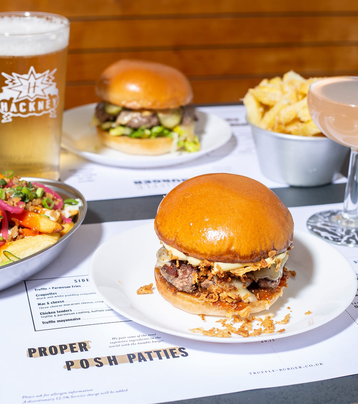
Fast-food vendors Truffle approached us at a time when they were looking to elevate their brand to a higher state of deliciousness. Our task was to dig deep and find a solution befitting of the best burger we had ever tasted.
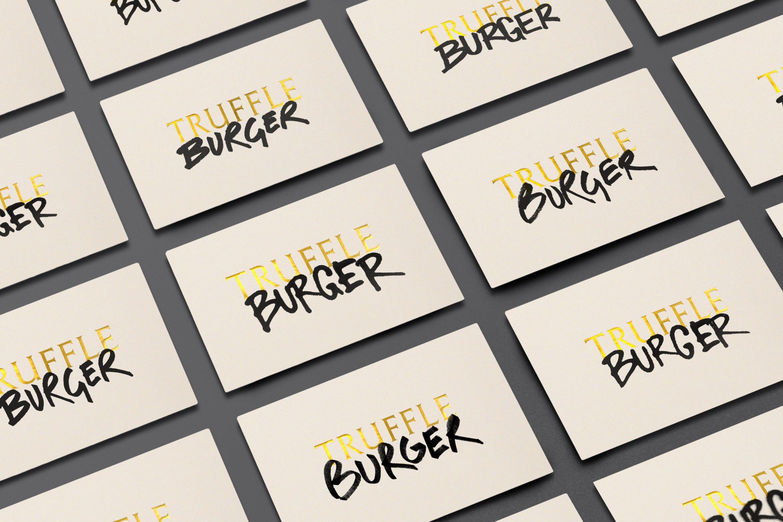
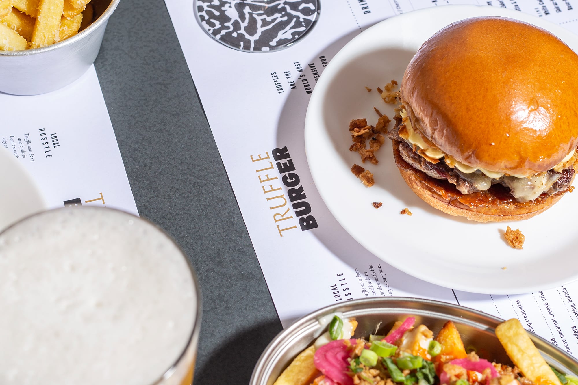
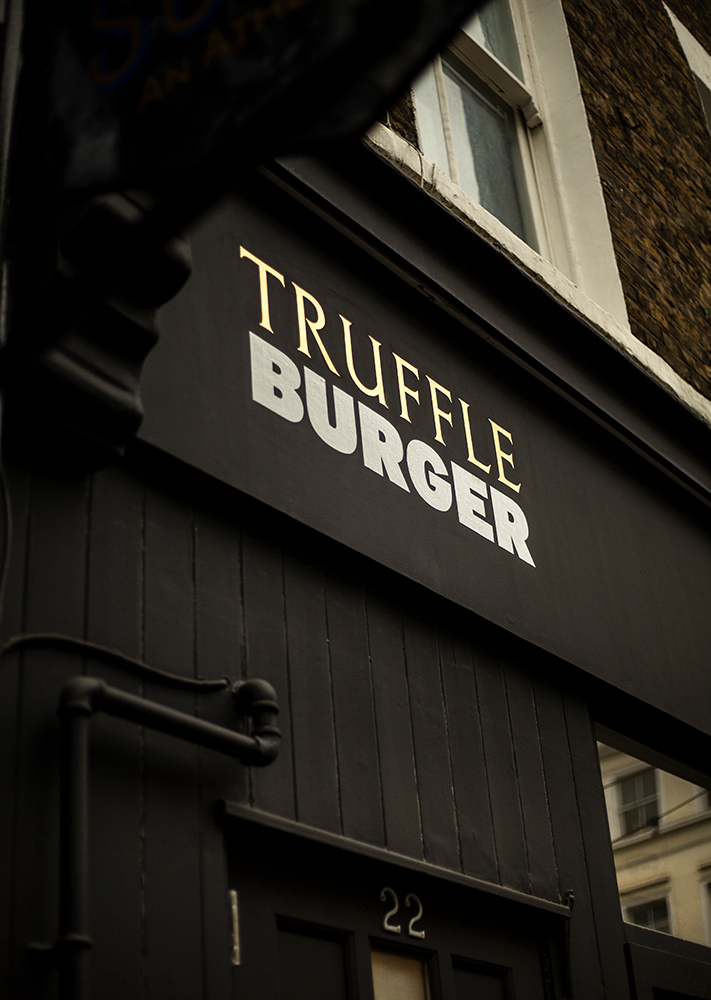
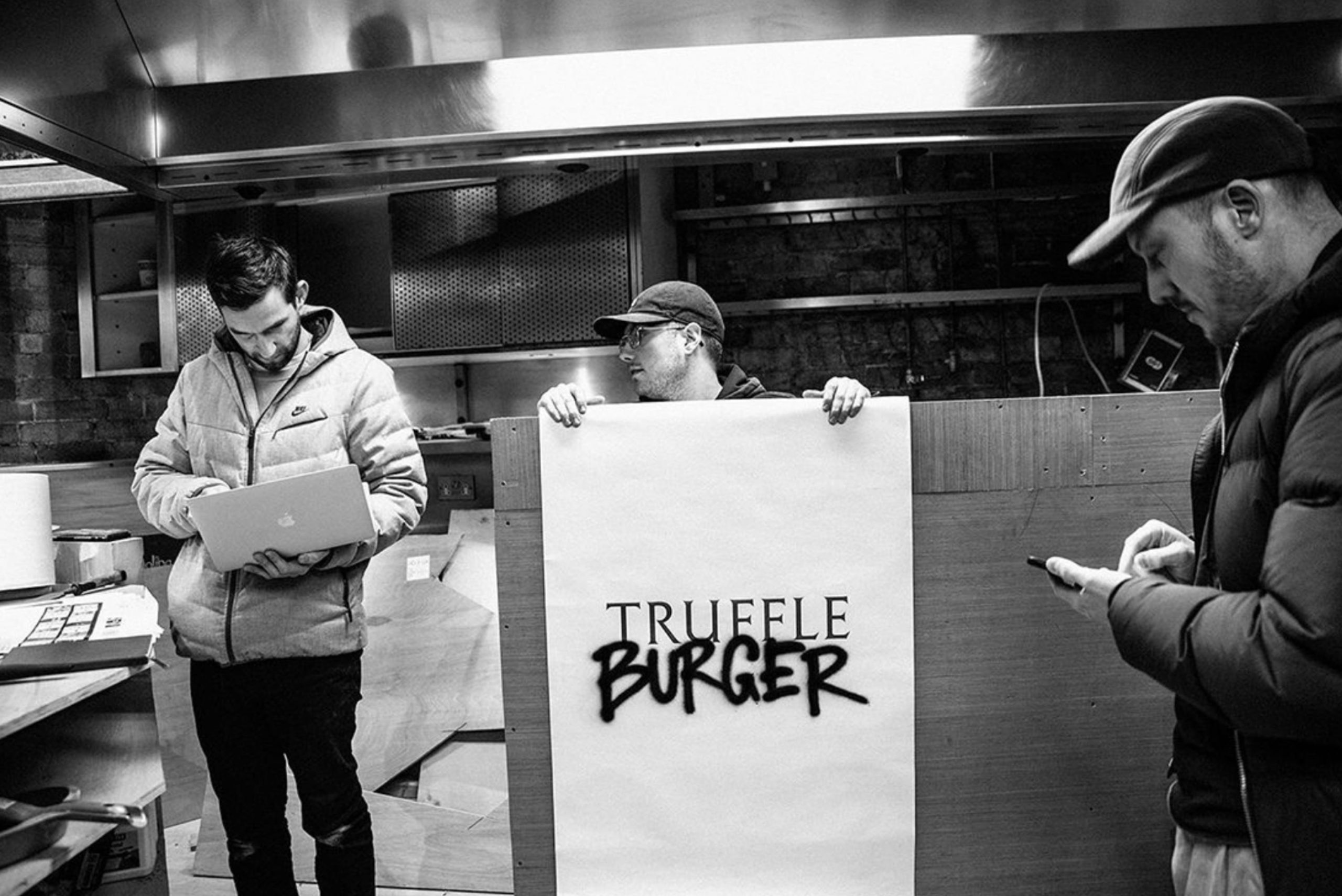
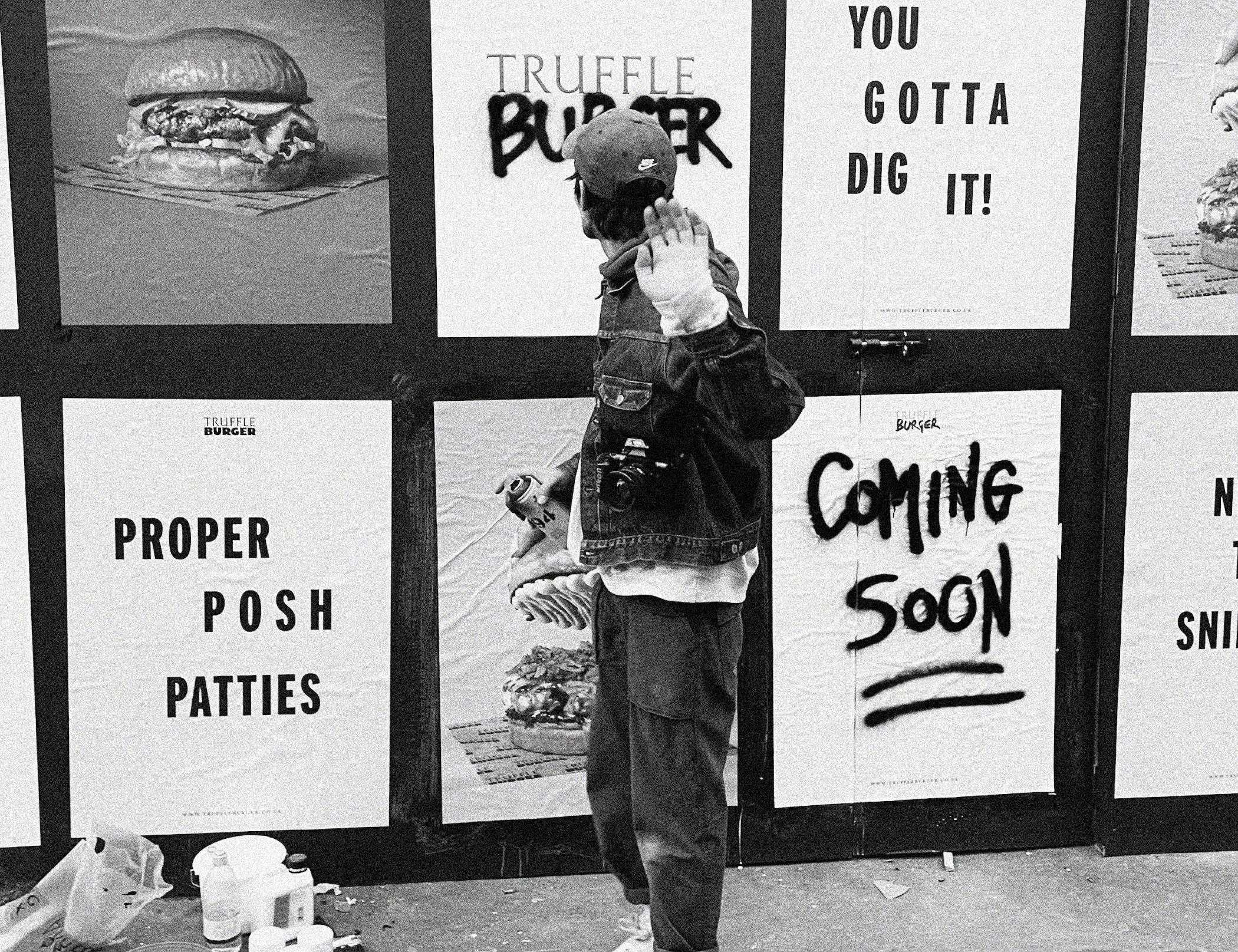
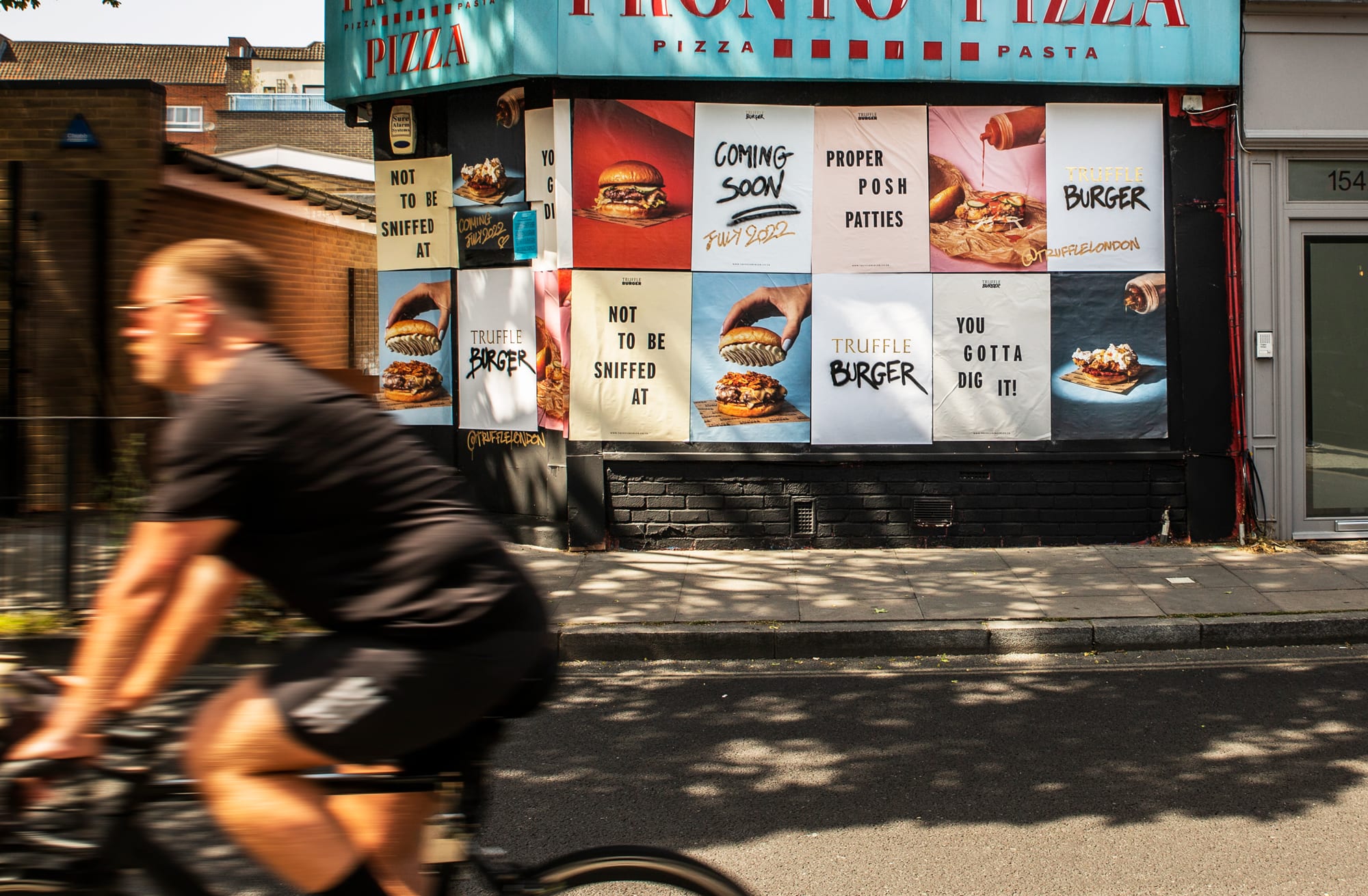
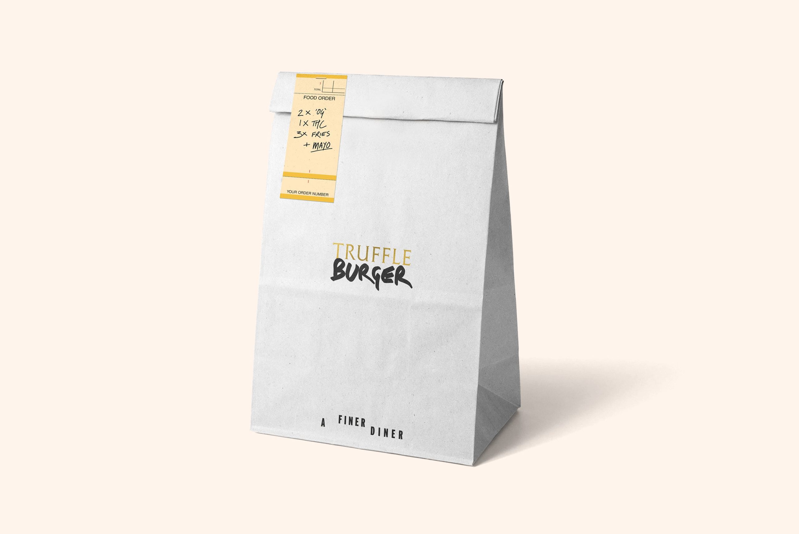
We began with a name update, broadening appeal by adding in the word ‘Burger’ to ground the offer in the name itself. This developed into a flexible logo system, comprising of an elegant typeset gold TRUFFLE, juxtaposed by a variety of hand rendered or meaty looking BURGER typefaces, bringing the looseness of the fast food world to the table.
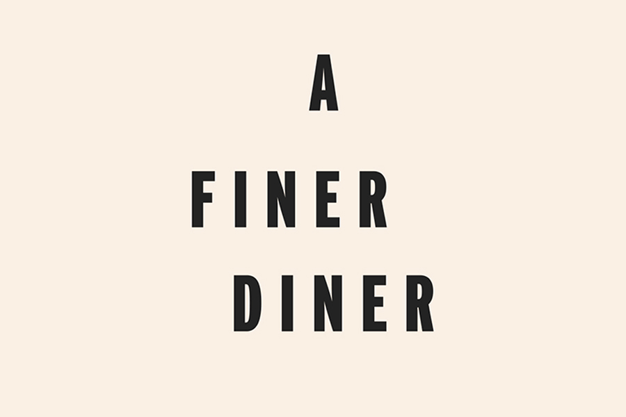
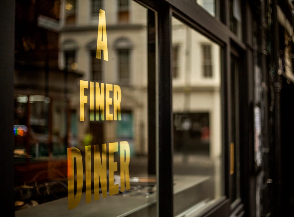
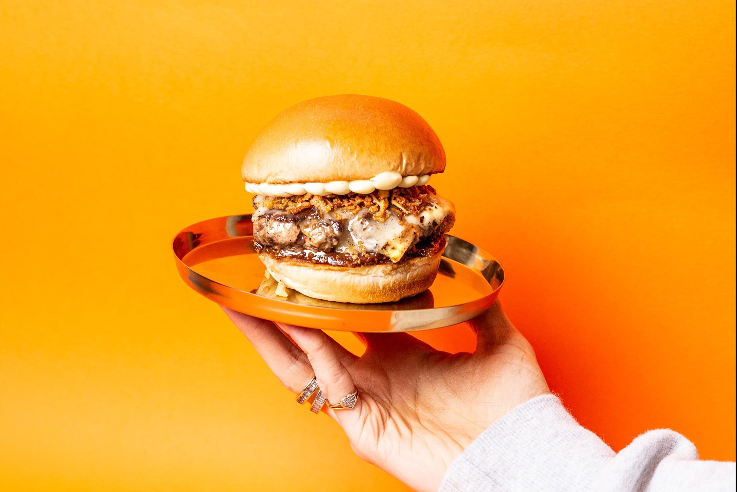
In and amongst the array of brand language ‘A Finer Diner’ rose to the top – itself an embodiment of the two contrasting worlds coming together. It became the brand positioning line, acting as a beacon to guide their creative path.
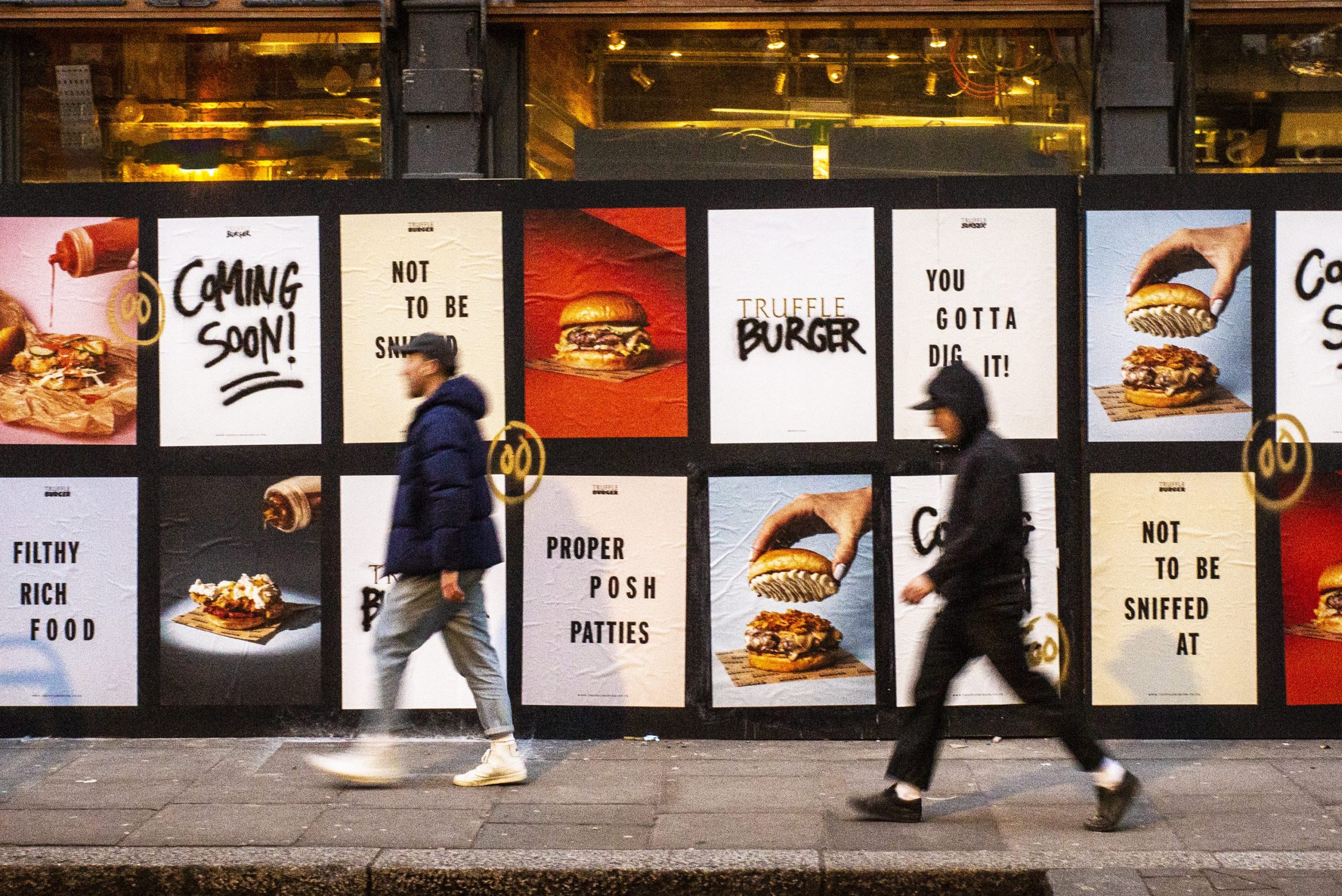
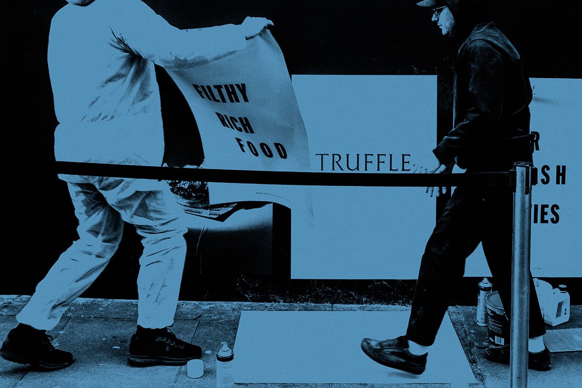
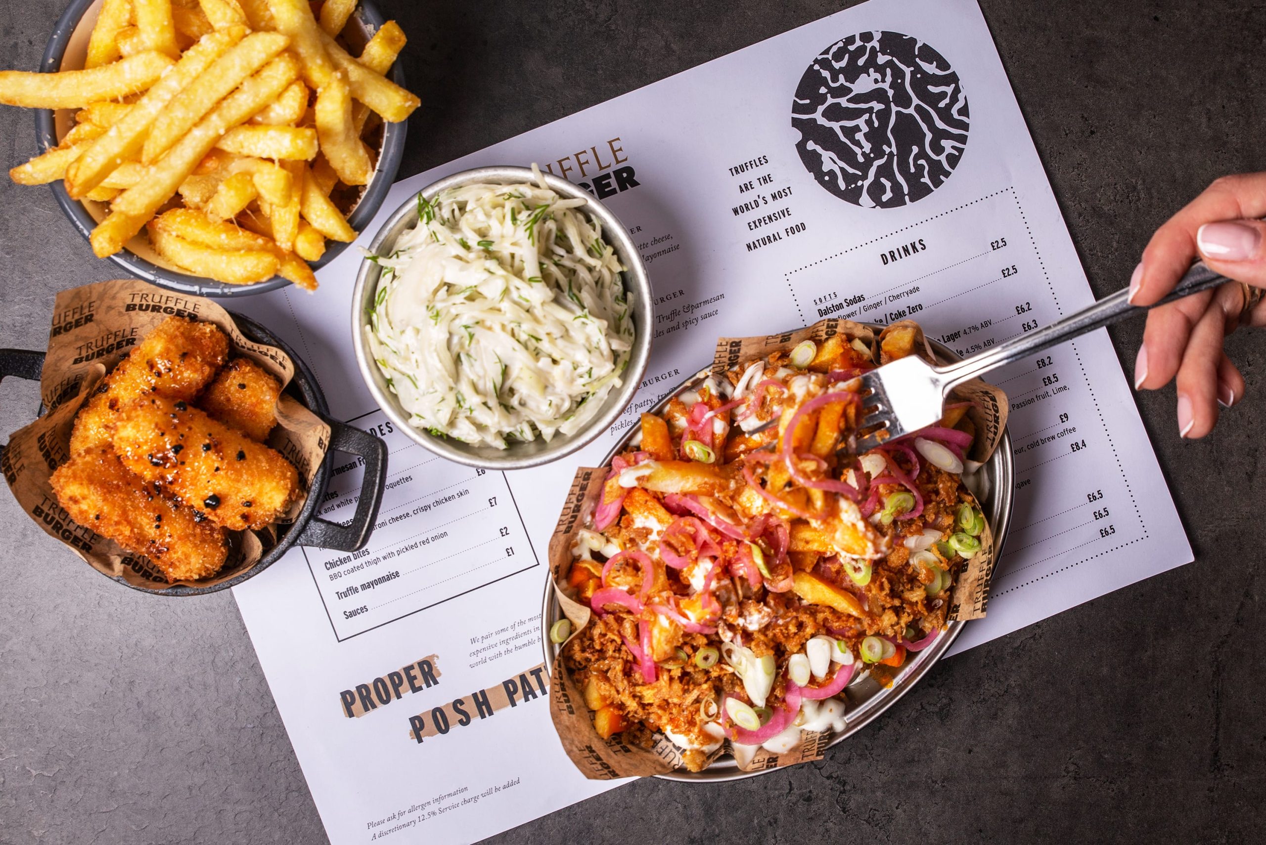
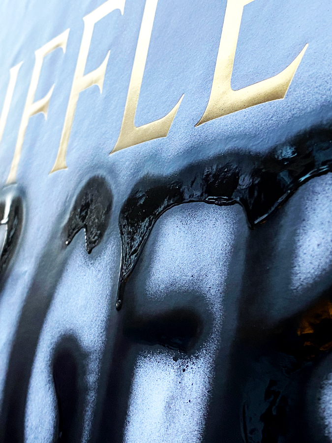
The juxtaposition of worlds was no more apparent than in the solution we devised for new site hoardings. A series of fly posters with glossy food shots and oppulent gold foiled details, spray painted in-situ for a lo-fi finish.
Since our rebrand, we have been able to really own our identity that for a couple of years lived mainly in our heads and culture. Working with Jonny and Joe, we were able to explore who we are and why we did certain things, bringing it to the physical & digital world and putting our Truffle Burger stamp on it. Land of Plenty, thank you!
Founder
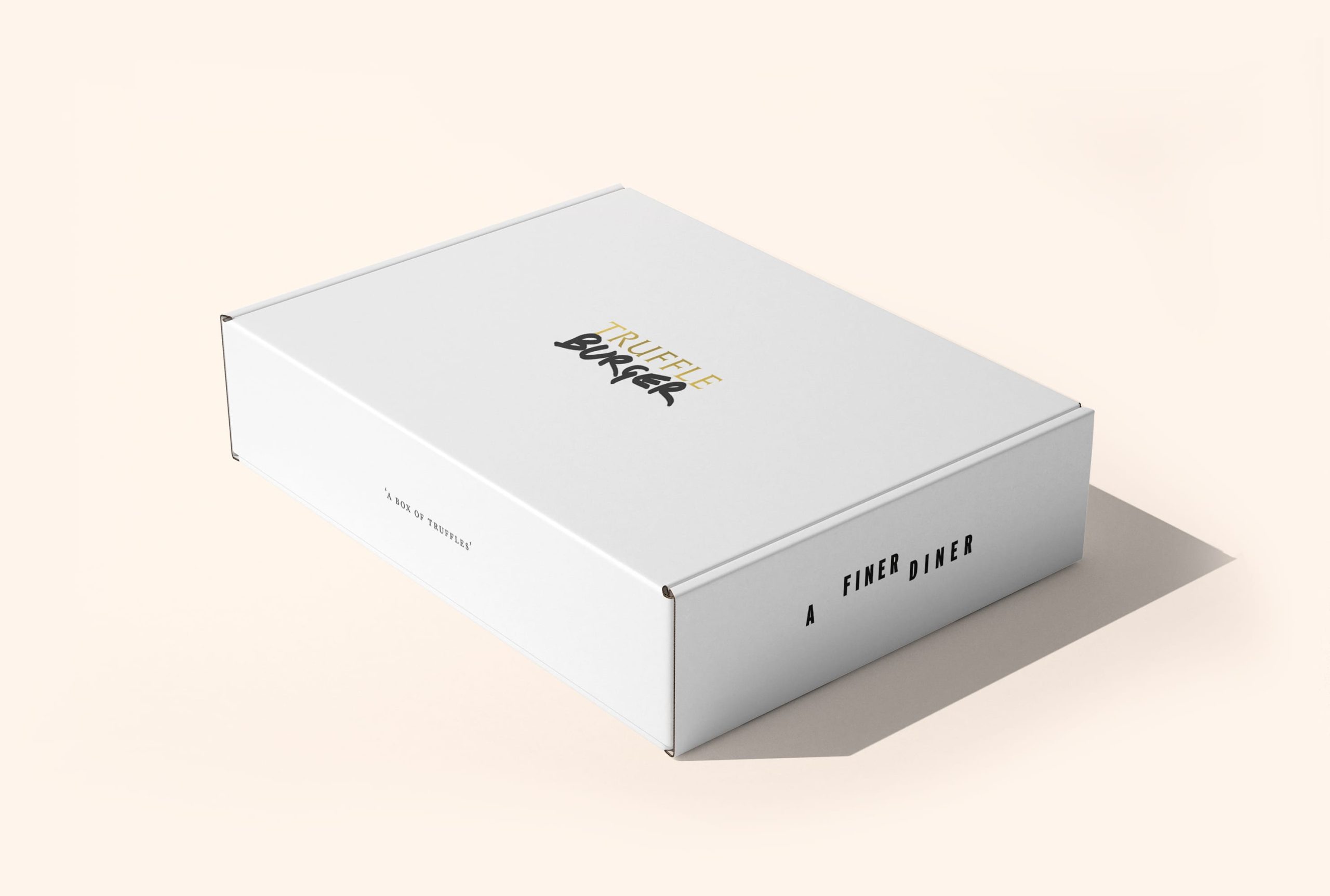
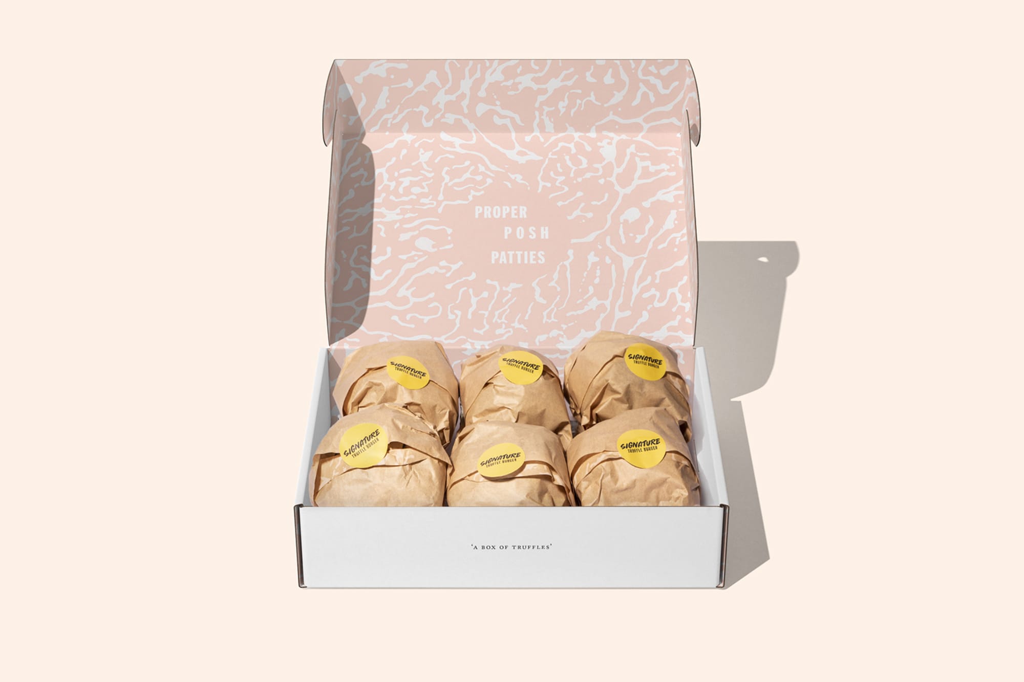
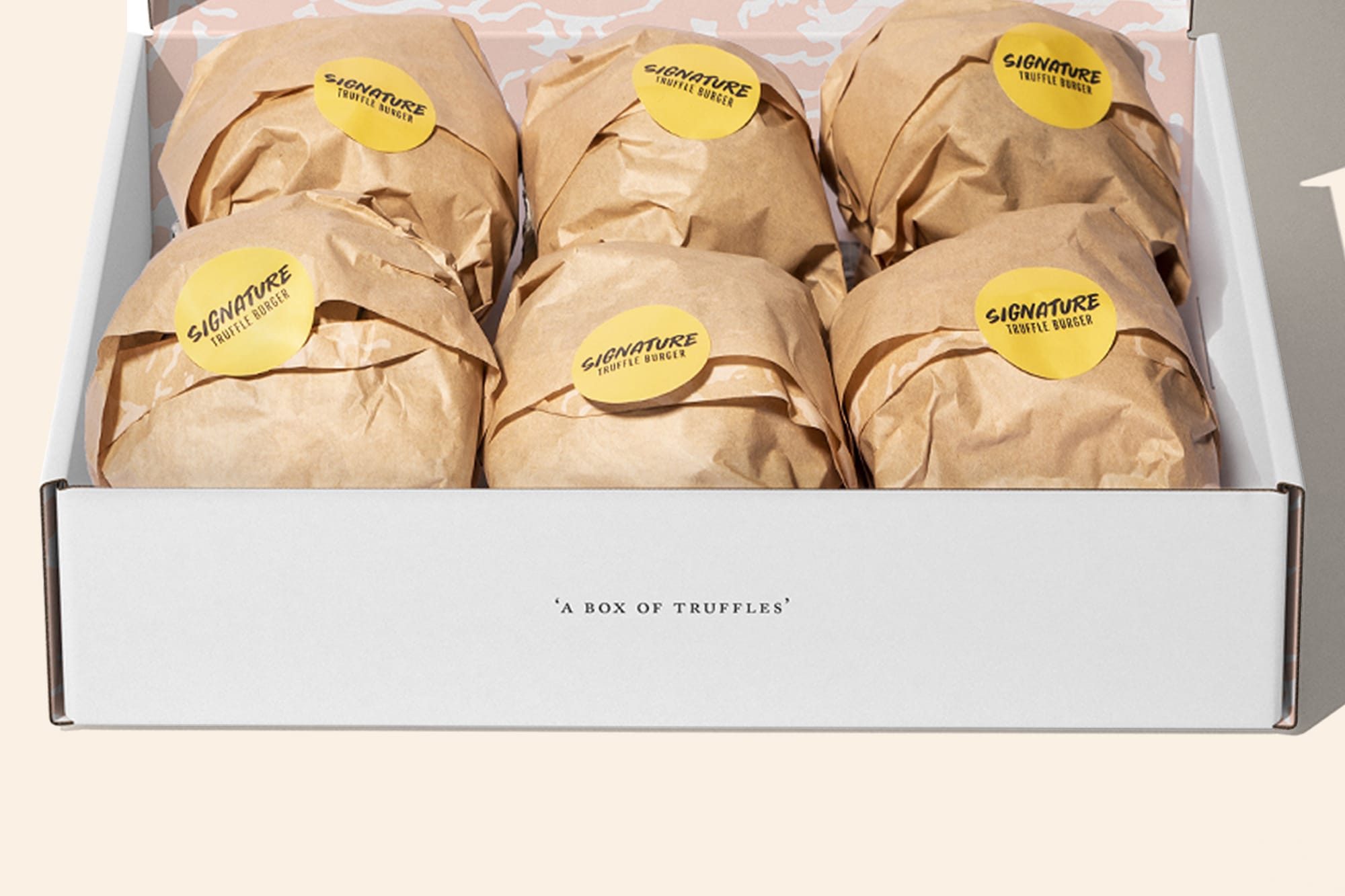
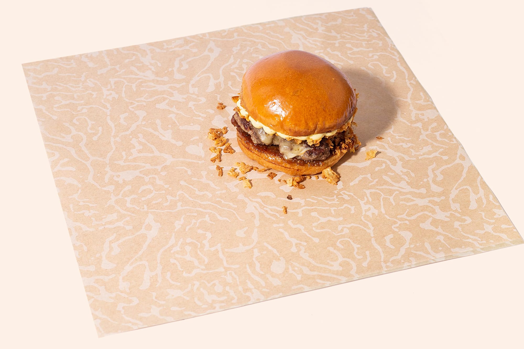
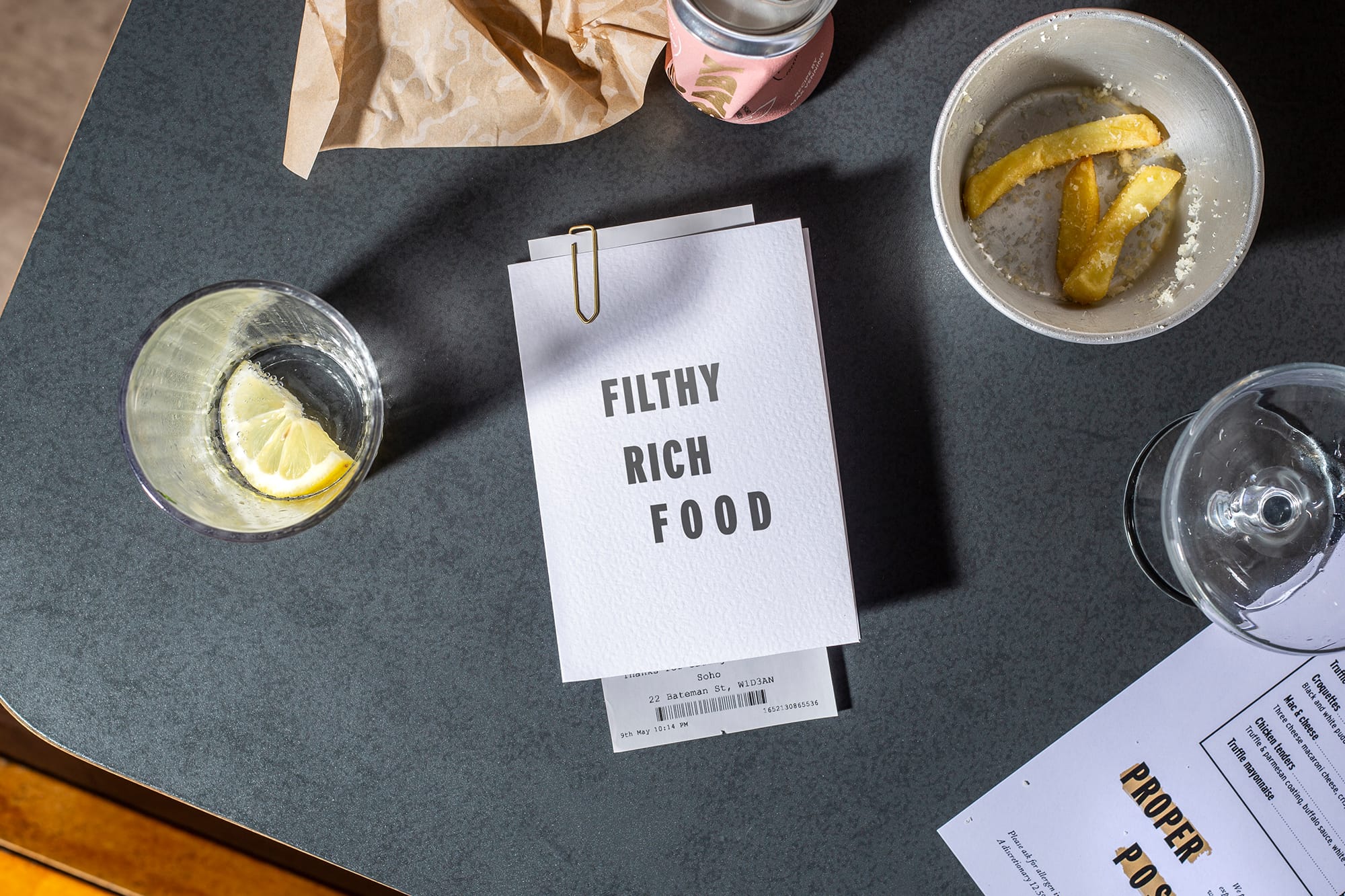
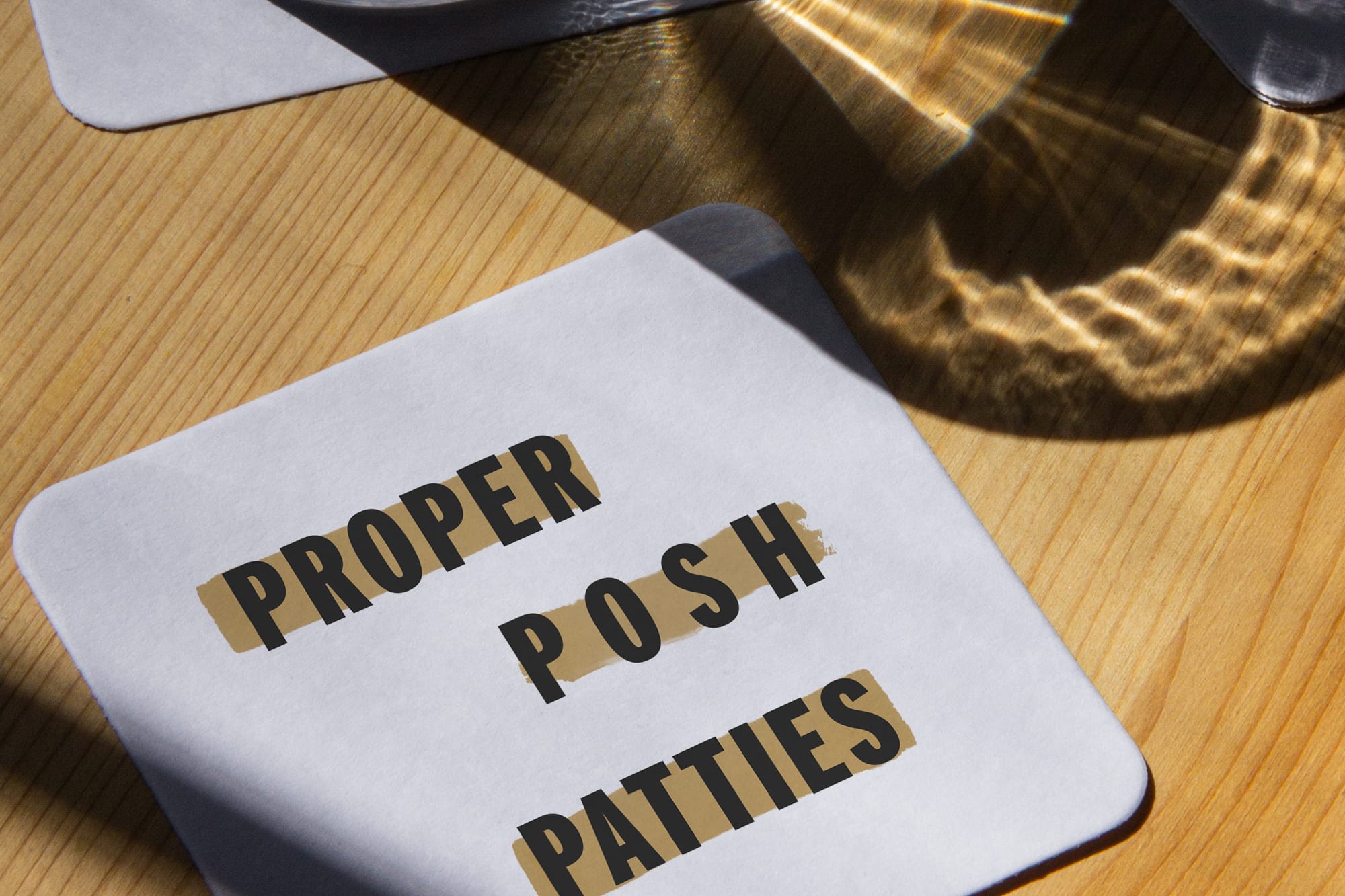
Beyond the core logos, we set out to build a brand with a balance of ingredients as appetising as the burgers themselves. A signature pattern was hand crafted, along with a playful language pool, riffing off the indulgent and unique world of truffles.